DOWNLOAD
Back to blog
Workspaces

The single-tasking sidebar: how to design a low-distraction dock

A practical guide to building a calmer sidebar around five core apps, clearer workspaces, and fewer visual cues that pull you out of focus.

Written by BallonieApril 24, 20266 min read
weballoon logo beside Ballonie and a calm sidebar-focused workspace scene.
workspacesfocusdigital minimalist

Why sidebars become attention traps

Most sidebars and docks slowly turn into visual to-do lists. They start as a shortcut area for the apps you use most, then grow into a permanent reminder of every tool, message, dashboard, and half-finished task competing for your attention. The result is not just clutter. It is constant low-level context switching before you even click anything.

That is why a low-distraction dock matters. A calmer sidebar should not reflect everything you have access to. It should reflect the handful of things you intend to use in the current mode of work. When your desktop keeps showing twenty possibilities, your brain keeps treating them as twenty active invitations.

Design for energy states, not app categories

One useful shift is to stop grouping apps by what they are and start grouping them by the kind of energy they require from you. A deep-work workspace might contain writing, docs, and one research app. An admin workspace might contain email, billing, calendar, and approvals. A creative workspace might hold design references, notes, and publishing tools.

weballoon is a good fit for this because workspaces already give you a natural context boundary. Instead of one permanent sidebar filled with every service you ever open, you can keep a smaller set of apps visible inside the workspace that matches the type of work you are doing right now. That makes the desktop feel intentional instead of reactive.

Use the 5-app rule to reduce app-hopping

The simplest rule is also the most useful one: keep only five core apps visible in the space where you expect to do focused work. The exact number is less important than the limit itself. Once the list becomes longer, the sidebar stops feeling like a launch surface and starts feeling like a browsing surface.

This matters because app-hopping often starts before the first meaningful decision. You glance at chat, then analytics, then inbox, then docs, and suddenly your "starting point" has already scattered your attention. A shorter visible set raises the chance that you open the one tool that belongs to the current task instead of sampling three unrelated ones first.

  • Keep only the handful of apps that belong to the current workflow
  • Move rarely needed tools out of sight instead of leaving them visible "just in case"
  • Let each workspace have its own small default set rather than one global mega-sidebar

Audit icons, labels, and visual noise

Not all distraction comes from app count alone. It also comes from how loud those apps look together. Bright multicolour icons, duplicated badges, and a mix of unrelated visual styles can make a sidebar feel busy even when the number of apps is reasonable. If your desktop feels restless, the problem may be visual density rather than raw quantity.

An icon audit is a simple fix. Keep the apps that matter, but notice which ones constantly grab your eye first. In practice, many people benefit from cleaner icon sets, fewer "urgent-looking" colours in one place, and a more selective use of always-visible communication apps. The goal is not aesthetic minimalism for its own sake. The goal is to make the right next step feel obvious.

Create one inbox space for transient apps

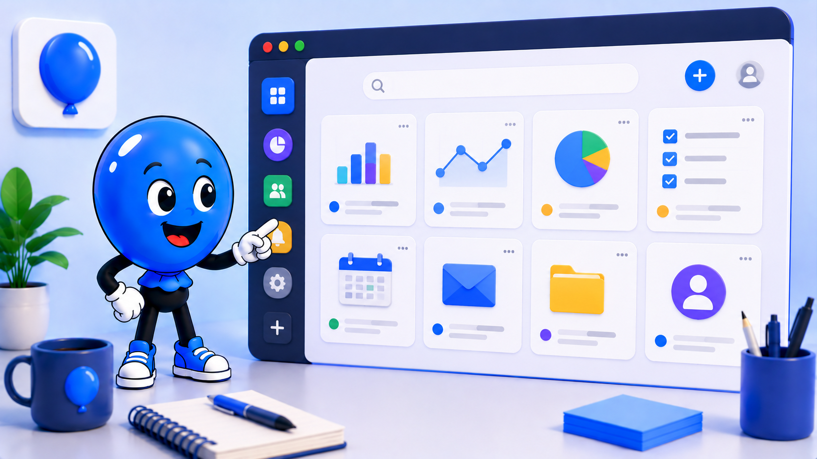
One of the easiest ways to protect a focused dock is to stop pretending every app deserves a permanent home. Some tools are genuinely temporary. You need them for a quick approval, a calendar check, a login flow, or a support reply, and then you do not need them shaping the rest of your day. Those apps should live in an inbox space, not in your main flow.

In weballoon, that can be a dedicated workspace for transient apps that you intentionally revisit and clear out by the end of the day. It gives low-commitment tools a place to exist without letting them colonize your core workspaces. By 5 PM, the inbox space can be reviewed, reset, or trimmed back down so tomorrow starts clean again.

Build a sidebar that reflects intention, not inventory

A good dock is not a museum of everything you use. It is a map of the work you mean to do next. That is why the best sidebar setups usually feel smaller, quieter, and slightly stricter than people expect at first. They remove visual decisions before your day has a chance to fragment.

If you treat weballoon workspaces as intention buckets instead of storage bins, the sidebar becomes much more useful. Five core apps for the current energy state, one inbox space for spillover, and fewer loud visual cues can make a bigger difference to focus than adding yet another productivity layer. The calmer desktop move is often subtraction, not expansion.

Key takeaways

  • A calmer sidebar should show intent, not every app you own
  • Group apps by energy state like deep work, admin, or creative mode
  • Use the 5-app rule to reduce app-hopping before it starts
  • Keep transient tools in a separate inbox workspace instead of your core dock

Keep the same calm setup across every workspace

Turn important web apps into cleaner desktop spaces with isolated sessions, focused workspaces, and fewer tabs fighting for attention.

More from the blog

More workflow notes, product thinking, and practical setup ideas that fit the same calmer desktop philosophy.

weballoon keyboard shortcuts for workspace switching with Shift+W and numbered jump shortcuts.
Apps & AlternativesMay 13, 2026

Best Arc Alternatives for People Who Prefer Keyboard Workflows

Arc Browser brought keyboard-driven browsing to the mainstream, but for power users who live in shortcuts, focused alternatives offer cleaner workspace switching and app isolation without the browser overhead.

Read more
weballoon workspace grid comparing app-centric organization with Arc-style browser spaces and sidebar layouts.
Apps & AlternativesMay 13, 2026

Best Arc Browser Alternatives for Organized Workspaces

Arc reinvents browser organization, but if you need true app-centric workspaces with per-app isolation, these alternatives provide a cleaner foundation.

Read more